

Africa Is Bigger Than You Think: Why Most World Maps Get Its Size Wrong

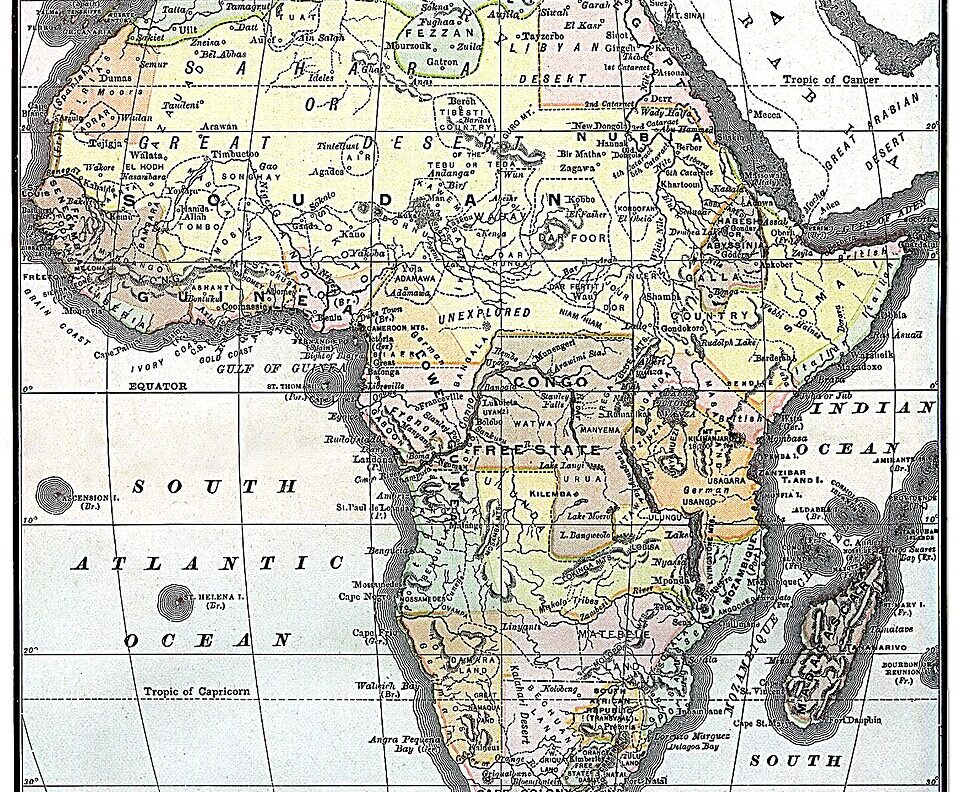
There is a good chance the map you grew up seeing made Africa’s true size look smaller than it really is.
Africa is not the world’s biggest continent. Asia holds that position. But Africa is enormous, covering about 30.3 million square kilometres. That makes it the second-largest continent by land area.
Yet on the familiar Mercator world map, Africa can look surprisingly small beside places such as Greenland.
That picture is about to face a major challenge.
Africa’s true size is hidden by the map we know
The problem is not Africa.
It is the way a round Earth is squeezed onto a flat surface.
Gerardus Mercator created the famous Mercator projection in 1569. His goal was not to show the true size of every continent. He wanted to help sailors navigate.
The projection does that well. Straight lines can represent constant compass directions.
However, it creates a major problem with size.
Areas closer to the Equator appear smaller. Areas farther north or south appear much larger.
That is why Greenland can appear almost as large as Africa on a conventional map.
In reality, Africa is about 14 times larger than Greenland.
READ ALSO: “How Nigeria and Africa can be rich in one generation”
What happened before the UN map vote?
The debate did not begin this week.
African governments and organisations had already raised concerns about how the continent appears on traditional maps.
The African Union adopted the Equal Earth projection in February 2026. It also urged member states to promote more accurate representations of Africa in schools and other institutions.
Togo later took the campaign to the United Nations.
The argument was simple: maps do not only teach geography. They can also shape how people understand the world.
That idea gained global attention on September 4, when the UN General Assembly backed a resolution supporting more accurate representations of continental landmasses.
The resolution received 164 votes. The United States voted against it, while six countries abstained.
Why the UN wants a different world map
The UN-backed approach points to the Equal Earth projection.
Unlike Mercator, Equal Earth aims to preserve the relative area of landmasses.
That means Africa looks closer to its actual size compared with Europe, North America and other continents.
The difference is striking.
Africa is large enough to contain the United States, China, India and most of Europe within its land area.
That fact can feel surprising because generations of people have become familiar with maps that distort those comparisons.
However, the UN has not banned the Mercator projection.
The resolution is not legally binding. It encourages governments, schools, international organisations and technology companies to consider equal-area maps when relative size matters.
Did the world get Africa’s size wrong?
Not exactly.
Africa was never actually smaller than it is today.
The issue is how its size has been represented.
Every flat map has to make choices because the Earth is spherical. A map can preserve area, shape, distance or direction, but it cannot preserve everything perfectly at once.
Mercator prioritised navigation.
Equal Earth gives greater weight to relative area.
That distinction matters because a map can influence what people learn before they ever study geography in detail.
For Africa, the new push is therefore about more than changing classroom maps.
It is also about correcting a visual impression that has lasted for centuries.
The continent was always enormous.
The difference is that the world may finally get a better picture of just how enormous Africa really is.