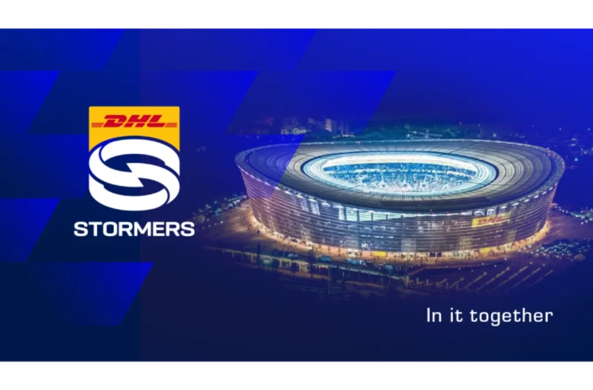
South African rugby: Stormers unveil new logo – watch the video

After nearly three decades, the Stormers have unveiled a refreshed logo, signalling a new chapter for the Cape Town side as they aim to conquer European rugby’s biggest stages.
The iconic “S” with the lightning bolt, a staple since 1999, has been redesigned. While the lightning bolt remains, it’s now subtler, complementing a logo inspired by the blue and white hoops of the Stormers jersey and the dimensions of Cape Town Stadium.
View this post on Instagram
According to Stormers Rugby, the new logo “features the iconic hoops of the Stormers jersey wrapping around and interlocking in a striking design which gives a nod to the heritage of the team, while also showing constant movement as the Stormers head towards an even brighter future.”
The design also “connects with a subtle lightning bolt in the centre, while the shape of the logo itself invokes the dimensions of the team’s home ground – Cape Town Stadium.”
“The new identity is however about far more than just a new logo. The Stormers’ unique strength is the incredible diversity of communities that come together to be united under the blue and white banner of the team,” the statement added.
Stormers Rugby CEO Johan le Roux emphasised that the redesign is about connecting with all stakeholders: We have seen some major developments to the way we operate and where we see ourselves going as a club. This felt like the right time to update our identity as we embrace a new era, with all of our stakeholders ‘In it together’ with us.
He added, The previous logo was over 25 years old and past due an upgrade. This new logo holds far more symbolism, with the hoops of the jersey making up an icon that represents the unity of the various communities that support our team. But this is about far more than just a logo. This is a statement about how we see ourselves and the way we connect with those who support us. We want all of them with us every step of the way as we break new ground.
Director of Rugby John Dobson commented on the alignment between the identity and the team’s mission: This team is one of the best-supported in the world. We have some of the most vibrant rugby communities and no shortage of passion at every level. This is a big step forward in many ways as we take the DHL Stormers from being a rugby team to so much more. We are ‘in it together’ with everyone who is coming on this exciting new journey with us.
Chief Commercial Officer Leontine De Sutter added, Our new identity and the campaign that we have launched seeks to bring our team and the communities that make us who we are closer than ever before. The ‘In it together’ campaign and our brand film beautifully encapsulate the essence of our team and our new brand proposition.
The ‘In it Together’ campaign involved a collaborative effort from top Cape Town creatives, including Duncan MacLennan (Creative Strategist, Sunny Futures), Chris Moore (Creative Director – Partners in Crime), Justin Gomes (Founder and Chief Creative Officer – Bananas Advertising), Anton Visser (Creative Director – Patriot Films), Zayd Halim (Executive Producer – Patriot Films) and Simon Ringrose (Music Producer).
As the Stormers set their sights on dominating both the URC and the Investec Champions Cup, this fresh identity represents far more than a visual update—it embodies the unity, diversity, and energy that makes the club so special to its fans and community.
With a world-class city as its backdrop, a unique stadium as its stage, and a passionate fanbase, the Stormers’ new era is defined by the mantra that resonates with everyone involved: “In it together.”

